feat(components): what the internal transfer redesign needed from the design system - #13
feat(components): what the internal transfer redesign needed from the design system#13romchornyi wants to merge 22 commits into
Conversation


`MenuItemAccessory.toggle` drew a system `Toggle`. The library ships its own
`SwitchView` — blue track, its own thumb and sizing, its own accessibility
value — and every screen that wanted the design system's switch on a menu row
had to skip the accessory and compose the two by hand, which is the opposite of
what the accessory is for.

It now renders `SwitchView`, so a row asking for a toggle gets the same switch
as everywhere else. `SwitchView` reads `isEnabled` from the environment, which
`.disabled` already sets, so the disabled state carries over unchanged.

Both types are `iOS 14, macOS 11`, so the availability of `MenuItem` is
untouched.
The "there is more to say about this" affordance, drawn rather than shipped as
an asset for the same reasons `XmarkIcon` is: it stays crisp at any size, and
the disc reads the `Blue` token instead of baking `#008DE4` into a PDF that
would then sit out the next palette change.

Geometry is normalized from the 19-unit source viewBox, so the stem and the dot
keep their positions and weight at any size. The dot is a 0.01-long segment
with a round cap rather than a circle — the source draws it that way, and it is
what guarantees the dot matches the stem's weight without a second constant to
keep in sync.
…em's mark

`infoIcon: DashIconSource?` could only ever be an `Image`, so the round info
mark the design system now owns could not be shown there at all — a caller
wanting it had to fall back to `.system("info.circle.fill")`, which is the
system glyph in the system's colour.

It becomes `info: MenuItemInfo?`:

- `.round(color:)` renders `InfoRoundIcon`, recoloured to suit the row — muted
  beside a settings title, or the Blue token where it should carry weight;
- `.icon(DashIconSource)` keeps the old behaviour for anything else.

A source break, deliberately: the parameter had one caller outside this
package's previews, and leaving both spellings would have meant two ways to say
the same thing.

Docs follow the change — `MenuItemInfo` in the row reference, `InfoRoundIcon`
in the icon catalog and the index, and the toggle accessory's entry corrected
to say `SwitchView` rather than `Toggle`.
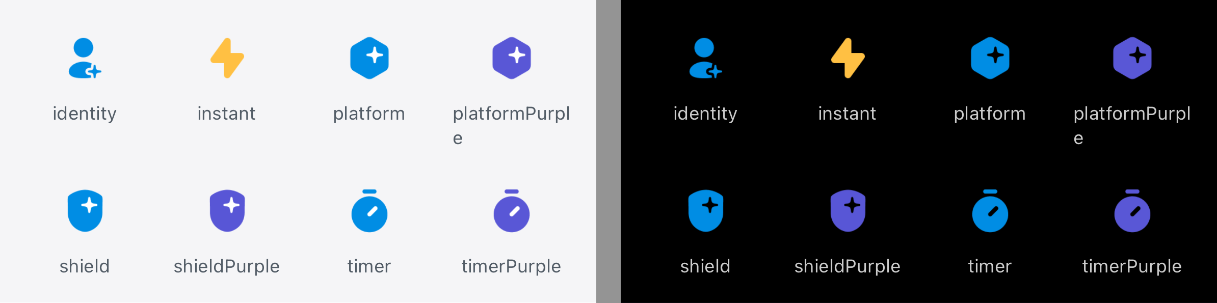
Three icons from the Figma export — identity, platform and shield — assembled
with the repo's own `normalize-icons.py` / `build-imagesets.py` pair into a new
`Features` group. Light only: the export ships no dark variants for these.

Each imageset carries `template-rendering-intent: template`, which the builder
does not write. Without it the PNG renders exactly as exported and ignores the
tint the caller sets, and these are meant to be recoloured at the call site.
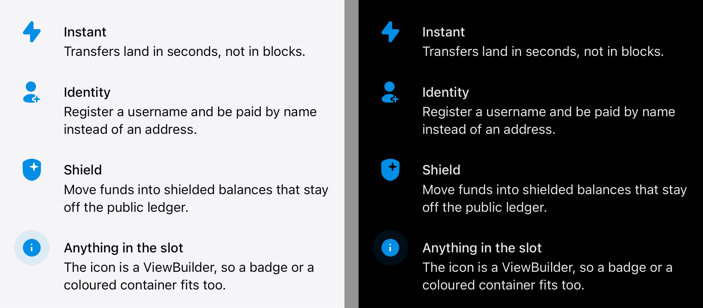
`BottomSheet.swift` moves into a folder of its own and is joined by
`SheetFeature` — the icon/name/description line a sheet stacks to say what
something gives you. It arrived in dashwallet-ios, where a component describing
sheet content had no reason to live.

The icon is a `ViewBuilder` slot rather than a `DashIconSource`: the leading
mark in this position is not always an image — a badge or a coloured container
belongs there too — and a convenience initializer still covers the common case
of a template asset with a tint.

The title takes `.subheadMedium` instead of `.subhead` plus `.fontWeight`,
which is macOS 13 and would have raised the component's floor; the weight is a
type token here anyway.
…to integration/menu-item-and-sheet-background

# Conflicts:
#	docs/navigation-and-containers.md
Two more from the same Figma export, assembled with `normalize-icons.py` /
`build-imagesets.py` into the existing `Features` group. Light only, as the
export ships no dark variants.

Both carry `template-rendering-intent: template`, which the builder does not
write — without it the PNG ignores the caller's tint, and these stand next to
the three already there that are recoloured per screen.
Template rendering draws the alpha channel in one tint, so `shield`, `platform`
and `timer` — each a coloured shape with white detail inside — lost that detail
wherever they were recoloured. The other two icons in the group are single
colour and are unaffected.

The fix is a second asset rather than a flag: an icon that must keep two
colours cannot also be tinted. These carry `#5957D6` (the Purple token) with
the white intact, and deliberately have no `template-rendering-intent` — a tint
applied to them would flatten them again.

`shield` is the designer's export. `platform` and `timer` are derived from the
blue originals: each pixel is a blend of white and `#008DE4`, so the blend
factor is recoverable from one channel and the blue end swapped. Checked
against the exported purple shield — 24 of 14400 pixels differ by more than 8,
all on anti-aliased edges.
The convenience initializer applied `.renderingMode(.template)` unconditionally
and tinted with a `Color.dash.blue` default, so an asset authored in more than
one colour was flattened to flat blue no matter what it contained — exactly the
case the purple `shield` and `platform` variants exist for.

`iconColor` becomes optional. Given one, the behaviour is what it was: template
plus tint, right for a single-colour glyph. Omitted, the asset renders as
authored and keeps its own colours.

The view is built before it reaches the slot: `Icon == AnyView` there, and a
`@ViewBuilder` if/else would produce `_ConditionalContent`. `.renderingMode`
likewise has to be applied to `Image` before the layout modifiers erase it.

The eight `feature-*` assets were the only group in the catalog with no entry
in `DashIcon`, so callers reached them by raw string — `.custom("feature-instant",
bundle: .dashUIKit)` — which a typo turns into a blank image at runtime rather
than a build error.

Four of them also still carried `template-rendering-intent: template`. Template
rendering discards an asset's own colours and takes the ambient foreground, so
anywhere the host does not tint — `MenuItem` sizes its leading icon and nothing
more — the blue glyphs drew black. `shield`, `platform`, `timer` and `identity`
become `original`.

`instant` deliberately stays template: `SheetFeature` takes an `iconColor` and
the transfer timing sheet passes `.dash.yellow`, which only works on a template
asset. The `-purple` variants are `automatic` and already keep their colours.

Co-Authored-By: Claude Opus 5 <noreply@anthropic.com>
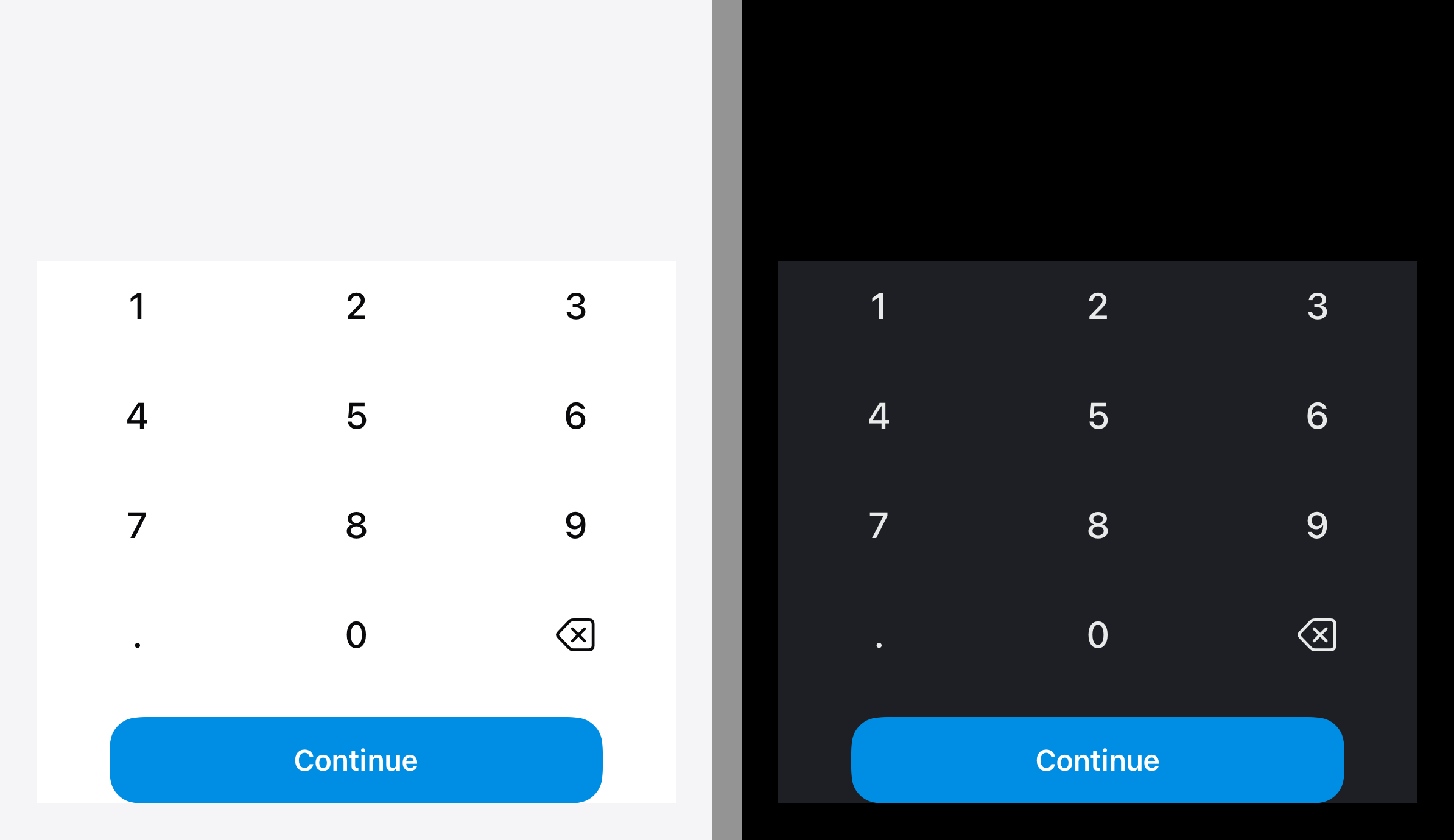
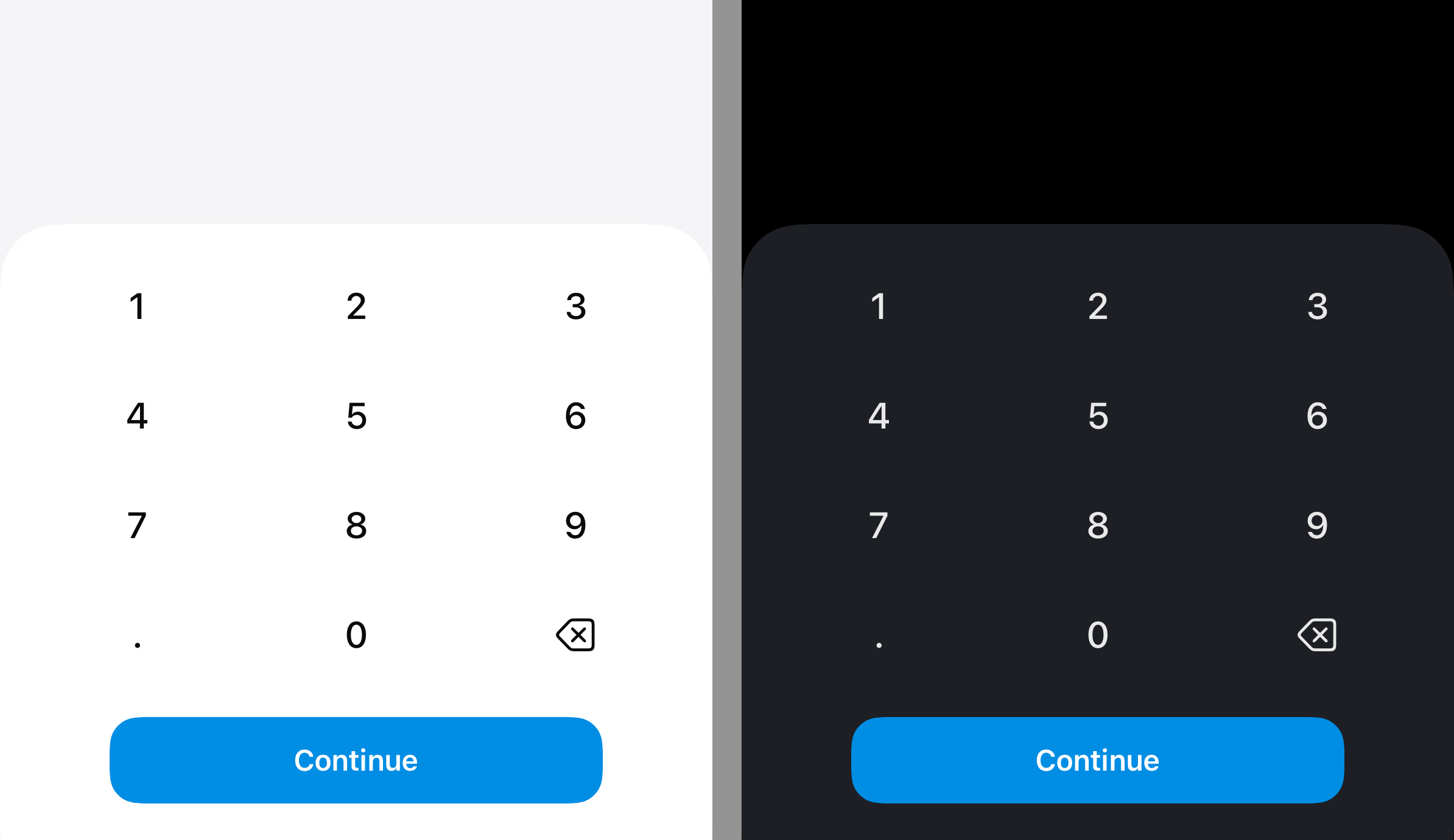
Every host drew the same chrome around it by hand — horizontal and bottom
padding, a `secondaryBackground` fill, a rounded top, and a second fill run
into the bottom safe area — and eight copies had already drifted: radius 20 in
some, `bottomPanelStyle()` in others, height caps of 320 or 290 sprinkled
where the keypad was expected to fit.

The component owns it now, so a caller is just the keypad.

Two API notes, both about the iOS 14 floor rather than taste.
`background(alignment:content:)` is iOS 15 and `UnevenRoundedRectangle` is 16;
the panel is instead a plain `RoundedRectangle` pushed below its own frame by
the corner radius, so only the top corners are ever on screen. `.continuous`
because the circular default kinks visibly where the arc meets the top edge at
this radius.

Co-Authored-By: Claude Opus 5 <noreply@anthropic.com>
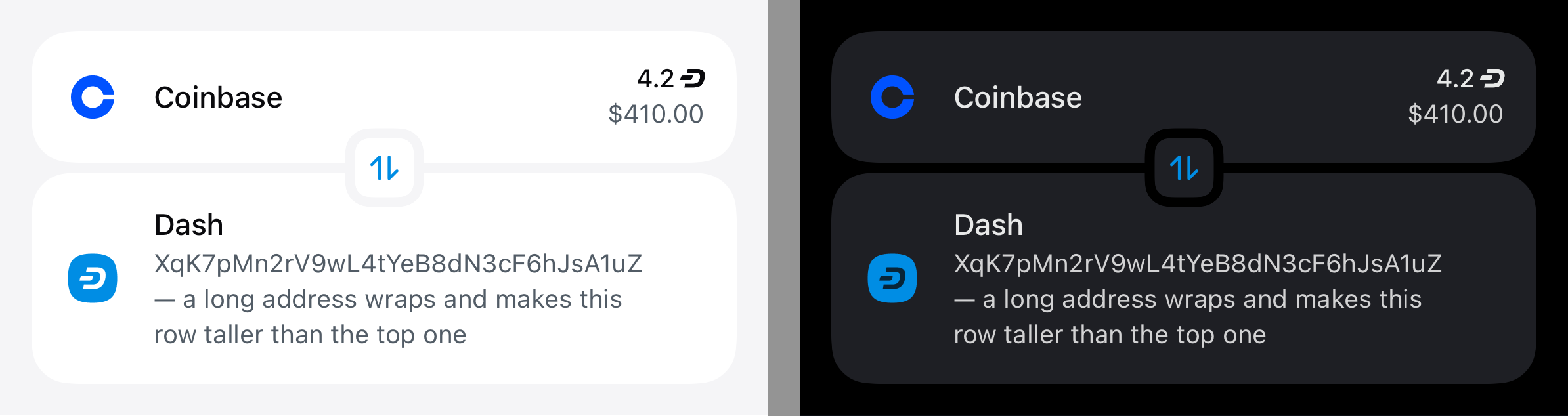
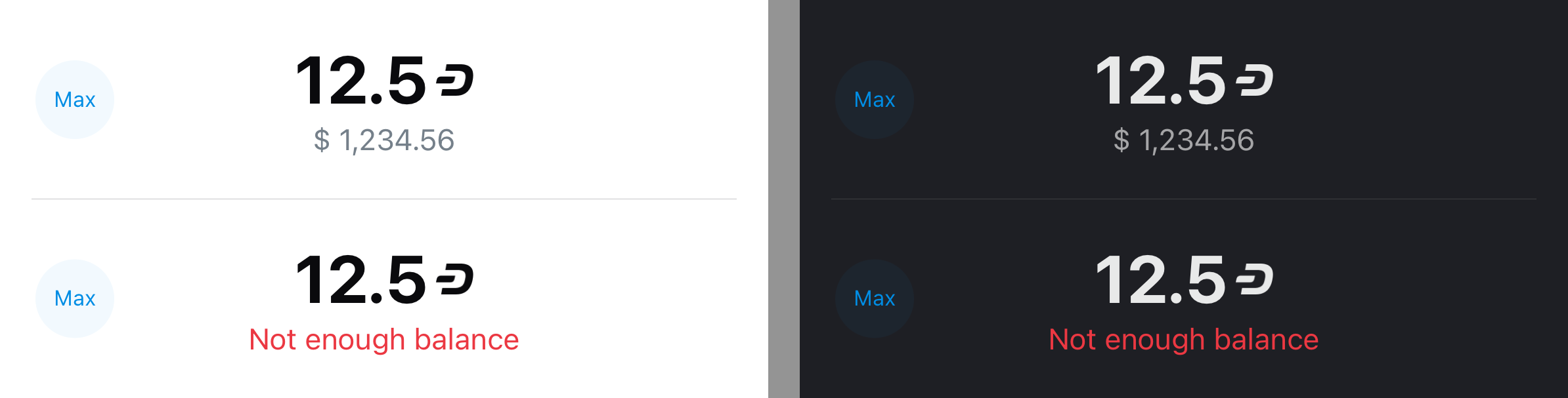
An amount the host refuses had nowhere to be said inside the component, so
callers put a warning row under the whole field — which pushes everything below
it down the moment it appears, for the one state where the layout should stay
still.

`errorMessage` takes the B row instead. The value, its currency symbol and the
chevron all give way to red text, so the line that was showing the converted
figure now says why there will not be one.

Pinned to `subhead` rather than the row's own font: that turns into
`largeTitle` when the secondary slot is the large one, and the message must not
grow with it. `lineLimit(1)` for the same reason — `scaleToFitWidth` shrinks a
long message rather than wrapping it and moving the cards below.

Co-Authored-By: Claude Opus 5 <noreply@anthropic.com>
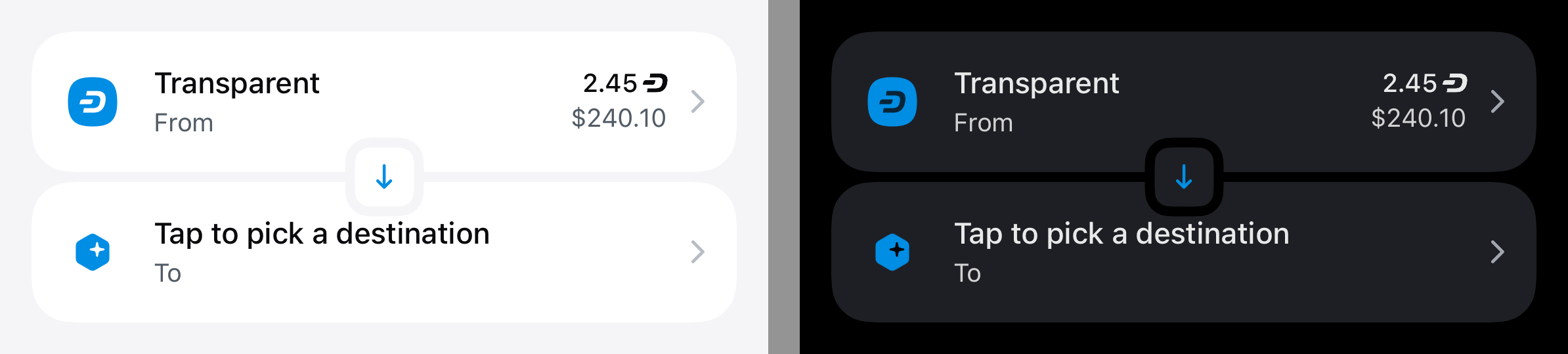
A ConverterCard row could show an endpoint but not offer to change it, so
screens that needed both drew their own picker affordance elsewhere.

`ConverterCardItem.onTap` makes the whole row a button. The chrome around it
swallowed touches from the day the component landed — deliberately, since the
seam badge was the card's only control — so `ConverterCardRow` gains
`isInteractive` and `ConverterCard` sets it for a row that has an action. It
defaults to false, leaving every existing row inert exactly as before; a
button placed inside without it would silently never fire.

Co-Authored-By: Claude Opus 5 <noreply@anthropic.com>
Picker rows had no design-system way to say which one is selected, so callers
reached for their own radio circles.

`CheckmarkIcon` draws the tick the way `XmarkIcon` draws the cross — a Shape
stroking the source SVG's polyline, crisp at any size and free of an asset.
Its artwork is 15x12 rather than square, so `size` sets the width and the
height follows the aspect ratio; the default colour names `Color.dash.blue`,
which is the #008DE4 the SVG strokes with, so the mark follows the palette.

`MenuItemAccessory.selection` puts it in the trailing slot, keeping that slot
occupied while unselected so nothing in the row shifts as the selection moves
down a list.

Co-Authored-By: Claude Opus 5 <noreply@anthropic.com>

|
Important
This repository does not receive automatic reviews because it has fewer than 10 stars. ⚙️ Run configurationConfiguration used: Path: .coderabbit.yaml Review profile: CHILL Plan: Pro Plus Run ID: Thanks for using CodeRabbit! It's free for OSS, and your support helps us grow. If you like it, consider giving us a shout-out. Comment |
A row that opens something needs a chevron, and the library had no general one
— only `chevron-down-currency-select`, a raster imageset named after the single
place it is used. Anything else reached for an SF Symbol, which does not follow
the palette and does not match the design's stroke.

`ChevronIcon` draws it the way `CheckmarkIcon` and `XmarkIcon` draw theirs: a
Shape stroking the source SVG's polyline, crisp at any size and free of an
asset. Only the right-pointing glyph is drawn and the other three rotate it, so
all four keep one geometry and one line weight — a set of four assets would
have to be kept in agreement by hand.

`size` sets the LONG side and the short one follows the 7x12 aspect ratio, so
the glyph never squares off into something the design did not draw. The frame
swaps its axes with the rotation: a `.down` chevron still measuring 7x12 would
leave a gap beside it and clip above.

The default colour names `Color.dash.gray300Alpha90`, which is the #B0B6BC at
90% the SVG strokes with, so the chevron follows the palette rather than a
frozen hex.

Co-Authored-By: Claude Opus 5 <noreply@anthropic.com>
`ConverterCardItem.onTap` made a row a button but left it looking exactly like
an inert one, so the only way to find out a row could be changed was to tap it.

The chevron follows `onTap` rather than a flag of its own: the two are set
together by definition — a row is given an action precisely because there is
something to open — and a separate `showsChevron` would only add a way for them
to disagree. Rows without an action are unchanged.

Co-Authored-By: Claude Opus 5 <noreply@anthropic.com>
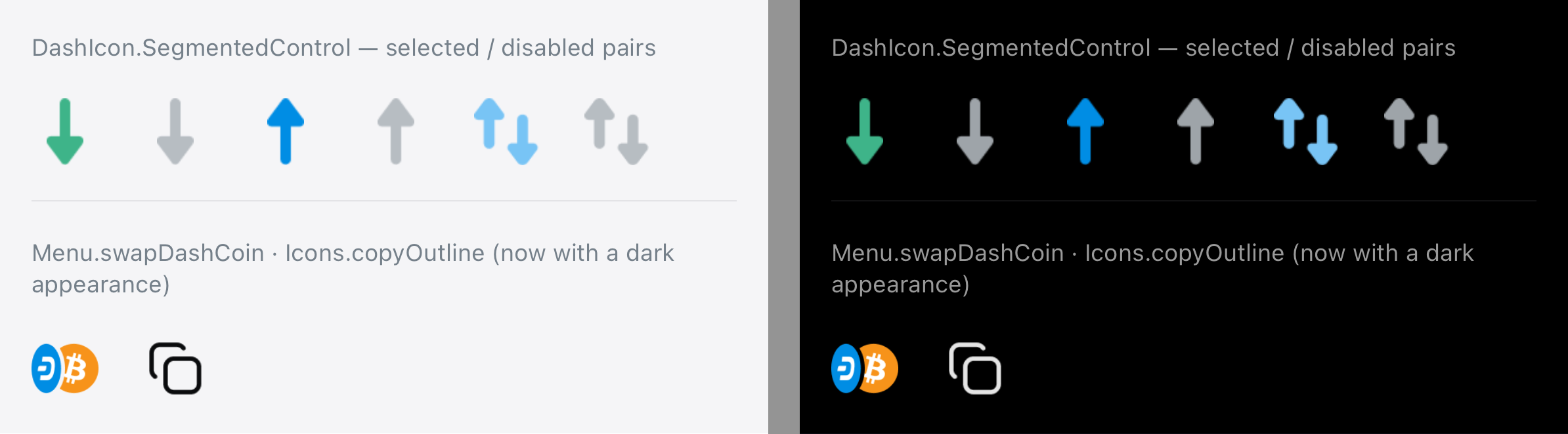
The payments landing's selector drew SF Symbol arrows in the ambient colour,
so the three tabs were indistinguishable until the label was read. The design
gives each direction its own colour, and the arrows are artwork rather than a
tint over one glyph.

Six assets: `segmented-control-receive` / `-transfer` / `-send` in green, light
blue and blue, each with a grey `-disabled` twin. Two files per direction rather
than one tinted two ways — the colour lives in the artwork, and a coloured arrow
dimmed to the unselected treatment would no longer match the grey label beside
it. Rendering stays `original` for the same reason: template would discard the
colour that is the whole point.

Named in `DashIcon.SegmentedControl` so a consumer cannot reach them by raw
string, where a typo is a blank image at runtime instead of a build error.

Light only for now — the export carried no dark variants. Re-running
`build-imagesets.py` with `--dark` will fold them into these same imagesets.

Co-Authored-By: Claude Opus 5 <noreply@anthropic.com>
`DashAmount` rounded to five places, which is right for a balance and wrong for
anything smaller: a Core network fee is a few hundred duffs, and at five places
0.00000226 DASH renders as "0". A confirmation drawn with this component
therefore told the user the fee was zero.

Five stays the default — enough to be exact at everyday sizes, short enough not
to dominate a row — and becomes a parameter rather than a constant.
`MenuItemAccessory.balance` carries it through, since a row is where a figure
like that is usually shown.

`DashAmountFormat` opens up with it: the default belongs beside the formatter
that applies it, and a default argument cannot reference an internal one.

Co-Authored-By: Claude Opus 5 <noreply@anthropic.com>
The payments Send tab gains a "Swap to other crypto" row and had nothing to
draw it with — `menu-convert` is the closest existing glyph and means something
else.

Imported as `menu-swap-dash-coin` rather than under the name it carries in the
design export (`swap-dash-coin`), which is the only file in that folder without
the group's prefix. Every asset in this group is `menu-*` and the raw value is
the asset name, so the odd one out would have been visible at every call site.

Light only, like the rest of the group — the export has no dark variant for it.

Co-Authored-By: Claude Opus 5 <noreply@anthropic.com>

…em-and-sheet-background
The glyph shipped in one appearance, so on the dark theme it stayed near-black
and disappeared into the surface it was drawn on.

Derived from the light asset rather than drawn: the artwork is a single colour
(0x0A0B0D) with anti-aliased alpha, and that colour is `PrimaryText`'s light
value. The dark variant is the same shape carrying that token's dark value —
white at 90% — so only RGB and the alpha multiplier change. Shape, edges and
transparent pixels are identical to the original.

Replace the files if design would rather draw it; the imageset is wired for two
appearances now either way.

Co-Authored-By: Claude Opus 5 <noreply@anthropic.com>
All eight shipped in one appearance. Each is a brand-coloured shape with a white
glyph cut into it, and on the dark theme that white read as a hole rather than a
mark — visible wherever they sit on a dark surface, the advanced-mode sheet and
the transfer endpoint picker among them.

Generated rather than exported: the design folder's "dark" copies of shield and
platform are byte-identical to the light ones, so there was nothing to import.
The white becomes black and the brand colour stays, which is what the reference
for the picker sheet shows.

The recolour is proportional, not thresholded. Every opaque pixel is a mix of
the brand colour and white; the mix ratio is read off luminance and replayed
towards black, so an edge that was 40% white becomes 40% black over the same
brand colour and no glyph gains a white fringe. Alpha is untouched, and each
icon's base colour is detected from its own pixels — blue, amber and purple all
came out right.

Done for all eight rather than the three that were reported: none had a dark
variant, and the rest would only have surfaced later.

Assembled with the repo's own `build-imagesets.py`.

Co-Authored-By: Claude Opus 5 <noreply@anthropic.com>
|
Every component in this branch, rendered off MenuItem — the info glyph
MenuItem —
|
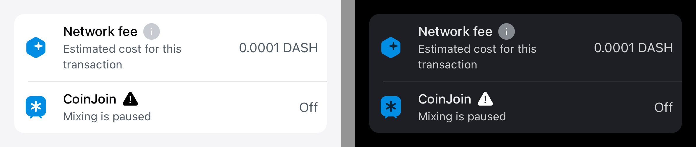
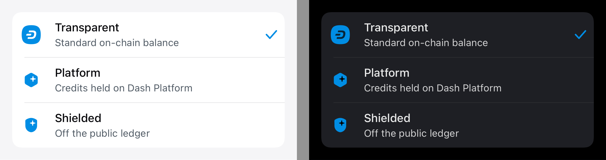
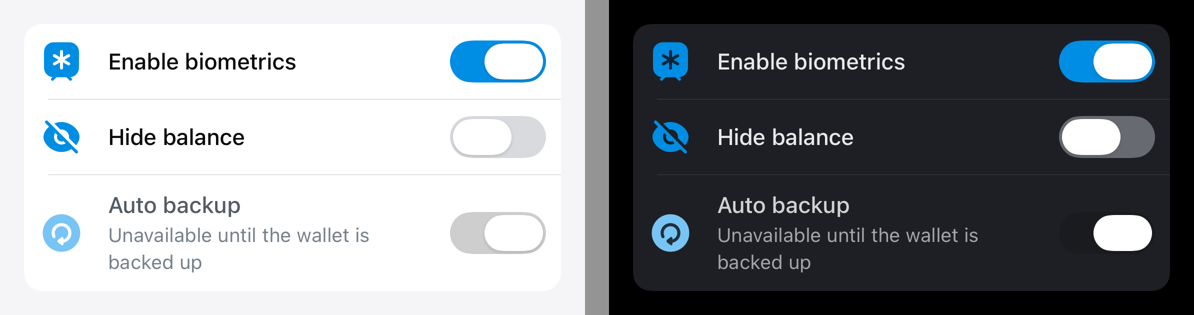
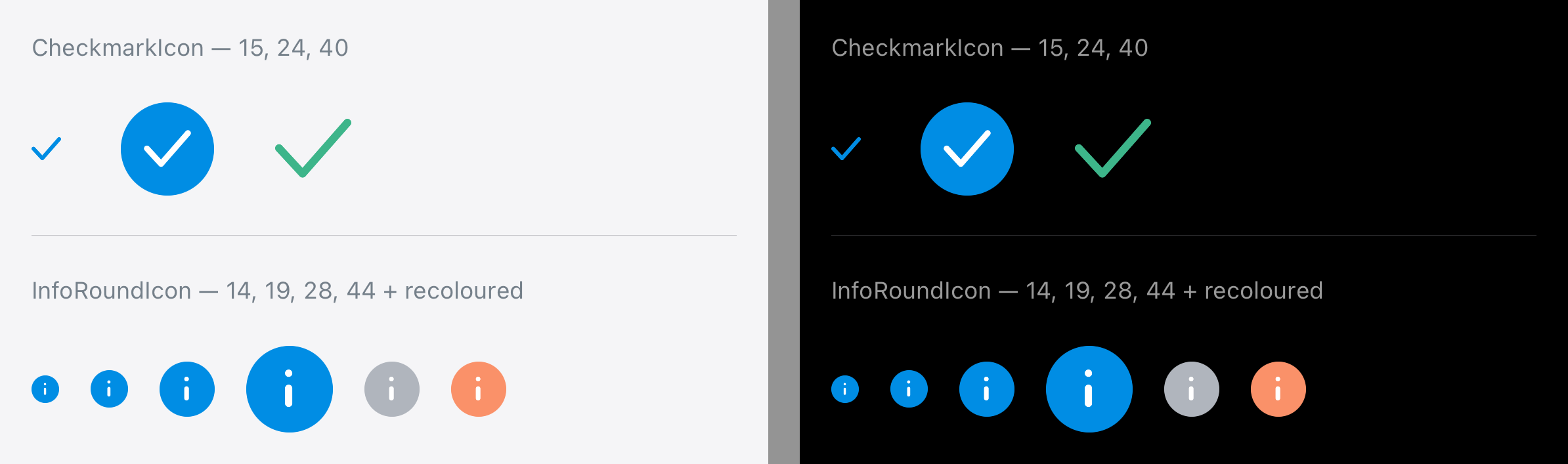


2 participants


Issue being fixed or feature implemented
The Internal Transfer redesign in dashwallet-ios kept running into gaps in the
design system, and each one was about to become a hand-drawn control in the
app: a menu row that needed an info glyph, a bottom sheet that needed a
feature header, a converter card whose rows could show an endpoint but not
offer to change it, and a picker with no design-system way to say which row is
chosen.
This branch collects those additions so the app can drop its local copies.
Screenshots of everything below — light and dark, rendered from this branch —
are in the comment underneath.
What was done?
MenuItem
MenuItemInfogives the info glyph a type —.roundfor the designsystem's own mark,
.iconfor anything else a row needs to flag.InfoRoundIcondraws that mark.MenuItemAccessory.selectionmarks the chosen row of a picker list, keepingthe mark's slot occupied while unselected so nothing shifts as the selection
moves down the list.
SwitchViewinstead of the systemToggle,which was green and UIKit-sized — a row rendered here did not match the
switch the design system hands out everywhere else.
.balancecarriesmaximumFractionDigitsthrough toDashAmount, so a rowshowing a figure smaller than the default rounds to can ask for more places.
CheckmarkIcon
.selection, drawn the wayXmarkIcondraws the cross: aShapestroking the source SVG's polyline, so it stays crisp at any sizeand needs no asset. Its artwork is 15×12 rather than square, so
sizesetsthe width and the height follows the aspect ratio. The default colour names
Color.dash.blue— the#008DE4the source strokes with — so the markfollows the palette rather than a frozen hex.
ChevronIcon
polyline, 1.6 stroke, round caps) rotated into all four directions, so every
chevron in the library keeps one line weight.
sizesets the LONG side andthe short one follows the aspect ratio, so an
.up/.downchevron iswider than it is tall rather than squashed square. Default colour is
Color.dash.gray300Alpha90.ConverterCard
ConverterCardItem.onTapmakes a whole row a button, for screens that usethe card as their endpoint picker rather than only as a display.
onTaprather than a flag of its own — the two are set together by definition, and
a separate
showsChevronwould only add a way for them to disagree. Rowswithout an action are unchanged.
deliberately, since the seam badge was the card's only control — so
ConverterCardRowgainedisInteractive, whichConverterCardsets for arow that has an action. It defaults to false, leaving every existing row
inert; without it a button placed inside would silently never fire.
BottomSheet
SheetFeaturegroups the icon/title/subtitle header the sheets keptrebuilding.
BottomSheetmoved into its own folder alongside it.SheetFeature'siconColoris optional and defaults tonil: given one,the icon is drawn as a template in that colour; left out, the asset renders
as authored, which is the only way a two-colour glyph keeps both colours.
NumericKeyboardView
adding that background itself, with slightly different corner radii and a
square fill leaking below the rounded corners into the home-indicator inset.
EnterAmount
secondaryErrorMessageputs a rejected amount's reason where the convertedvalue goes, instead of pushing a line in below the row. Threaded through
EnterAmountView→DualSwapAmountView→SwapAmountView.DashAmount
maximumFractionDigitsis a parameter rather than a constant, with the oldvalue kept as
DashAmountFormat.defaultMaximumFractionDigits(5). Five isright for a balance but rounds a Core network fee of a few hundred duffs
away to zero, and that figure has to be shown somewhere.
Icons
Featuresgroup inDashIconfor the eightfeature-*assets:identity,instant,platform,shield,timerand purple variants ofthe two-colour ones.
be tinted to stay legible on a dark sheet, and none renders as a template —
a template draws the alpha channel in one tint and flattens a two-colour
glyph away. A caller that does want a single-colour glyph tinted asks for it
through
SheetFeature'siconColor.copy-outlinegained a dark appearance for the same reason.direction's colour, plus a grey
-disabledtwin, so a segment switches filerather than tint when the selection moves.
menu-swap-dash-coinfor the swap-to-crypto menu row.Docs under
docs/are updated for every addition above.How Has This Been Tested?
swift buildclean.#Previewcoverage in its own file, including the statesthat are easy to get wrong: the unequal-height
ConverterCardrows (thebadge must stay on the seam), the tappable-versus-inert row, a picker list
where only one row is marked, and
CheckmarkIconat three sizes.comment below come from that pass, off this branch, through a throwaway
snapshot harness that is not part of the commit.
dashwallet-ios, which consumes this branch as a local package: the payments
landing, the transfer form, both endpoint pickers and the confirm sheet.
That build is green and was walked through in the simulator.
Not yet run on a device, and not yet checked at accessibility type sizes
beyond the previews that pin them.
Breaking Changes
None. Every addition is additive and defaulted:
ConverterCardItem.onTapis the last init parameter and defaults tonil;rows without it keep the exact view hierarchy they had, including hit
testing, and stay chevron-less.
ConverterCardRow.isInteractivedefaults to false, preserving the originalswallow-all-touches chrome.
MenuItemAccessory/MenuItemInfogained cases rather than changingexisting ones;
.balancegained a defaulted parameter.DashAmount.maximumFractionDigitsdefaults to the value that was hardcodedbefore, so every existing call site formats identically.
NumericKeyboardViewnow draws its own panel, so hosts that were drawingone will double up until they drop theirs. Existing in-tree callers are
updated; out-of-tree ones should remove their background.
The package still targets iOS 14 — nothing here raises a component's floor.
Checklist: